These are 11 of the best blue and green paint colors to use in your home! I have used them in our renovations, new build, and in family member’s houses, they are our go-to’s! Light will play a huge role in how these colors appear in your home, so make sure you sample before you buy and see how they look at different times of day!
GREEN PAINT COLORS
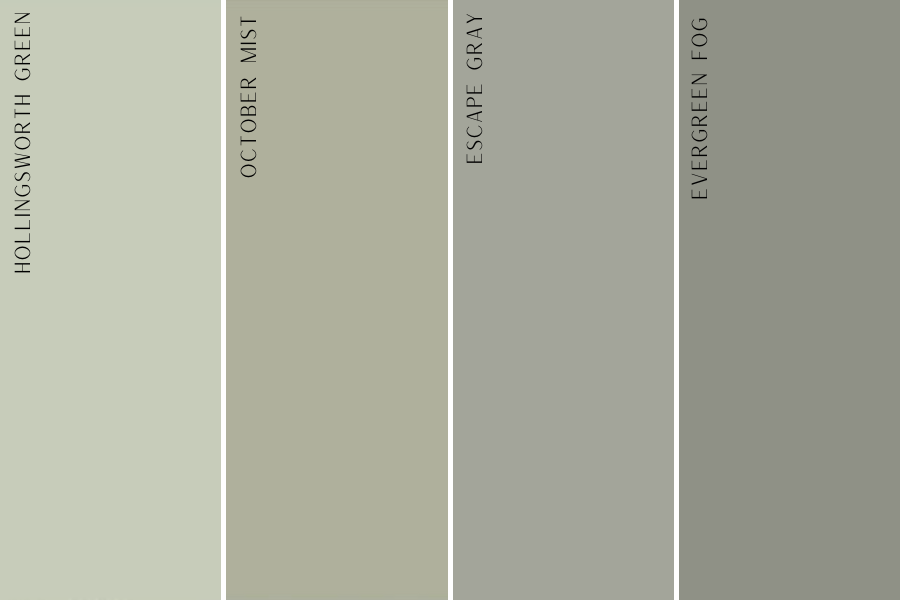
Green paint colors have so many different undertones. You can have a cooler toned gray, warmer gray, a green in the sage family, olive family, more of a mint… you name it! It may look so light in the store, but so dark in person, or vice versa. I have compiled a roundup of my favorite green colors, with various shades and tones, that you should try out in your home!
Hollingsworth Green
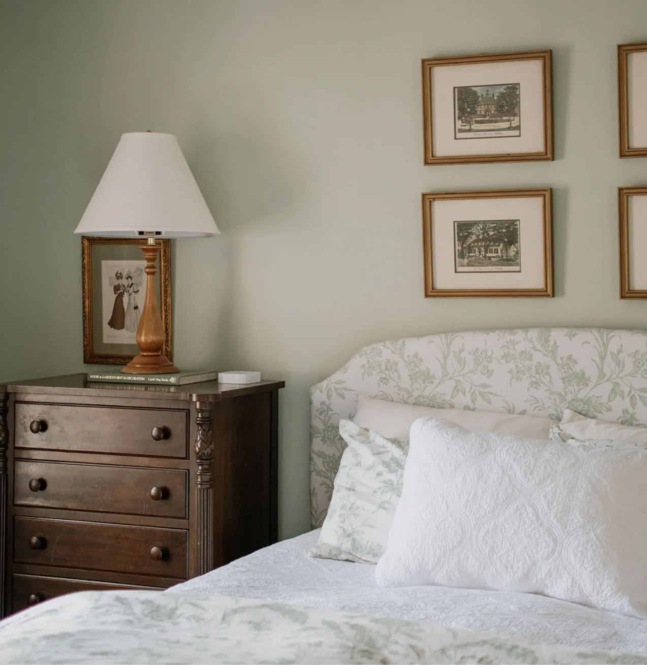
Benjamin Moore’s Hollingsworth Green is the lightest of my green choices. I would say it leans a little more sage/mint green than olive. It is so pretty and the perfect green for an english cottage style. I also think it is the perfect green for a more classic, southern style bedroom, or even a gender neutral nursery. Any space that you want a pop of color but to still keep it lighter, this is your color. Heather over at C’est Bien used Hollingsworth Green perfectly!
October Mist
October Mist was the 2022 color of the year, and it is still one of my favorites. It’s in the olive/sage family, but on the lighter side which is exactly what I was going for in our guest room. Some rooms that I would use this color in – nursery, guest bedroom, color drenched dining room, or bathroom. It would pair so well with the right wallpaper!
Escape Gray
Sherwin Williams Escape Gray is the perfect medium/dark green that is still subtle enough. Though the name says gray, do not be fooled. This is a green paint, I wouldn’t even consider it to be in the gray family. It adds depth and dimension with the fact that it is a darker shade, but it is still versatile enough to be a multi-use color.
Evergreen Fog
Sherwin Williams Evergreen Fog is the darkest of my green choices. It is in the same family as the Escape Gray, just a bit darker. This would be perfect as the trim color in a dining room with wallpaper, an office space, media room, or any room where you want a moody vibe. Just likeEscape Gray, it leans more gray/green than an olive color that would have yellow undertones.
BLUE PAINT COLORS
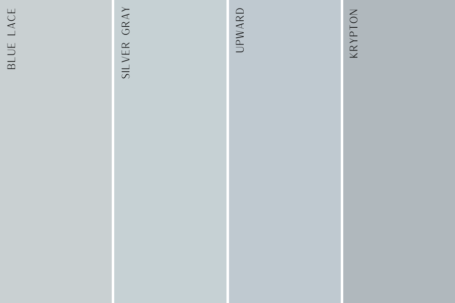
Blue paint colors (especially pale blue) can be some of the hardest ones to get right. The different undertones that are in the blue family make these colors look so very different. These samples also look like completely different paint colors depending on the light reflection in the space. Some appear more green than they look on a sample, a lot lighter on your wall, or even too periwinkle. I cannot stress enough, spend the $5 and get the samples!! I would do a minimum of four samples on the wall before making your decision, and make sure you check the paint at all times of the day to factor in the light! These are some of my favorite blues to use.
Blue Lace
Benjamin Moore’s Blue Lace is the perfect pale blue, very subtle, and not too much of a green hue. It is part of the Benjamin Moore Classics colors. This blue is perfect in a bedroom/nursery, or even a dining room for a classic southern blue. I have seen this paint color paired with light blue buffalo check bedding and it was stunning!
Silver Gray
Another paint color with “gray” in the name, that is in fact not a gray color. Silver Gray by Benjamin Moore is another light blue, with green undertones, and is a bit more hued than the muted Blue Lace. This one also makes a beautiful exterior paint color if you are looking to paint vinyl siding.
Upward
This is the Sherwin Williams color of the year for 2024! Upward is the perfect denim blue with cool gray undertones. It is soft, versatile, and does not have any green undertones. A classic blue color! This one would also look great if you wanted to make it less saturated, like a 50% strength, if you want a lighter blue for your space!
Krypton
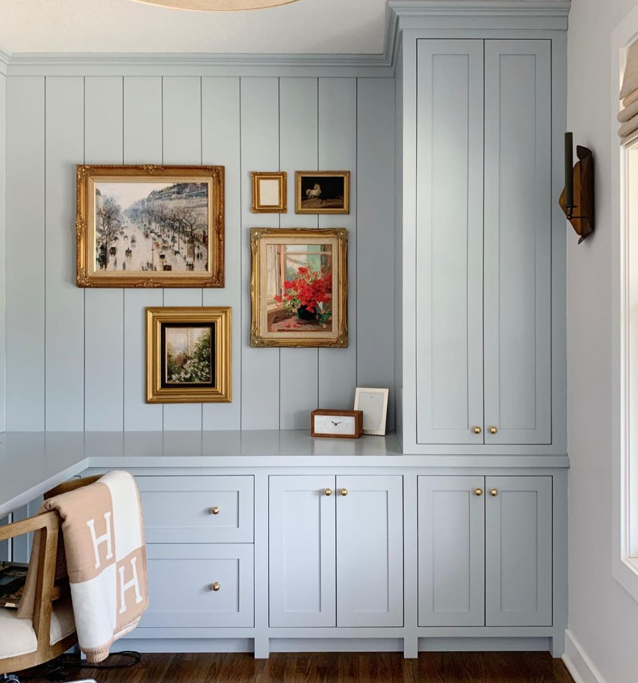
Krypton is the darkest of my blue selections, and it sure is stunning. It isn’t too dark at all, but is distinctly more blue. I saw this used a few years ago by Melissa over at Oho Interiors, and it is still one of my favorites! Soft, calm, inviting, and the perfect pop of color! There is a lot of light in the room that she used this color in, but as you can see above, the sample appears a bit darker. Make sure you test this one out in your room to make sure the light reflects how you want it to!
BLUE/GREEN PAINT COLORS
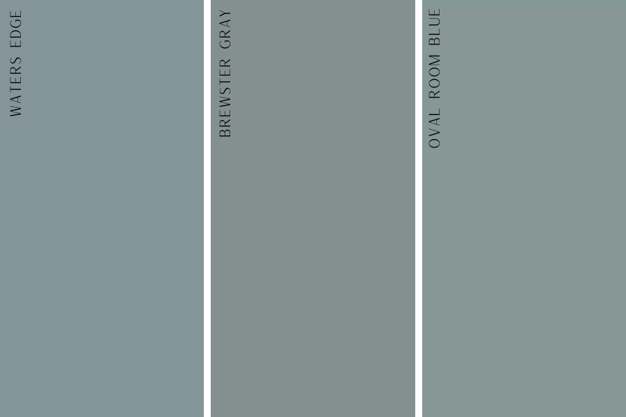
This is a popular look right now since both blues and greens are in. I will give my potentially unpopular opinion on this color family – be selective with where and how you use this. I love a blue/green for a bold space – a library, media room, a kids room where you know you might end up changing the color in the future. Don’t be afraid to use these darker colors! Just make sure, again, that you are sampling these with all of the light in your home throughout the day.
Water’s Edge
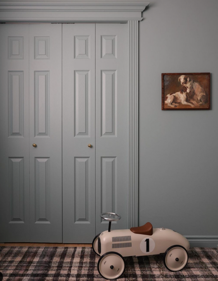
Benjamin Moore’s Water’s Edge is the most blue toned option of the three. It’s rich and bold, and a beautiful combination of both blue and green. I picture this one in a boy’s room with vintage sports equipment, or a vintage car theme! This would also make a gorgeous office or library room color.
Brewster Gray
Brewster Gray by Benjamin Moore is the most neutral blue/green I’ve chosen. It falls directly in the middle of both colors. Again, a “gray” without actually being a gray. I love this color in a mudroom, powder bath, or any of the other rooms listed above, but it would also look great on furniture!
Oval Room Blue
A perfect combination of a blue/green color is Oval Room Blue by Farrow and Ball. This is by far my favorite mixture of the two colors, soft, almost slightly muted down, and is the the perfect combination, It’s the most green of the three options, but it’s not too blue, not too green. It looks amazing in a color drenched space like Megan did (Hart Interiors) in her little boy’s room.
These are my all time favorite blue and green paint colors. I will say it again, get samples!! Make sure these colors end up being what you’re looking for based on the light in your home and which direction your house faces.
Thanks for the advice! Trying to decide what colors to use for my daughter’s room but don’t really want to do pink. Think I’ll go with one of these blues!
We are using one of these blues in my daughter’s room as well! They are dainty and subtle!